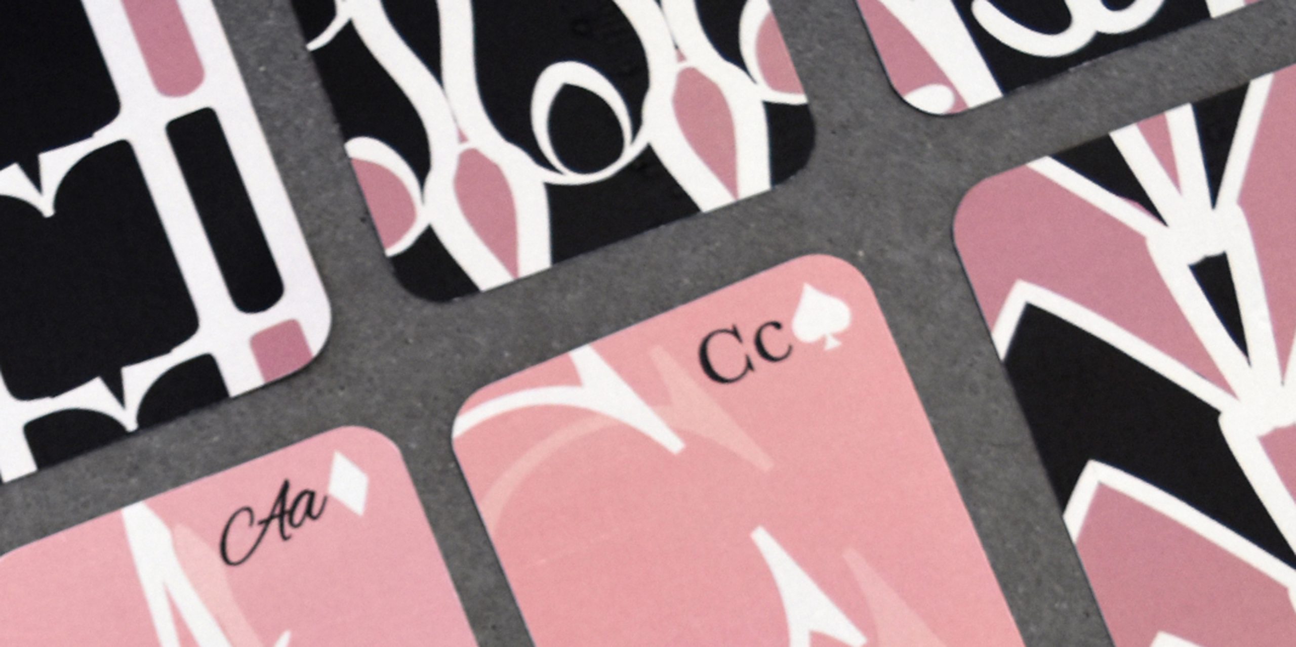
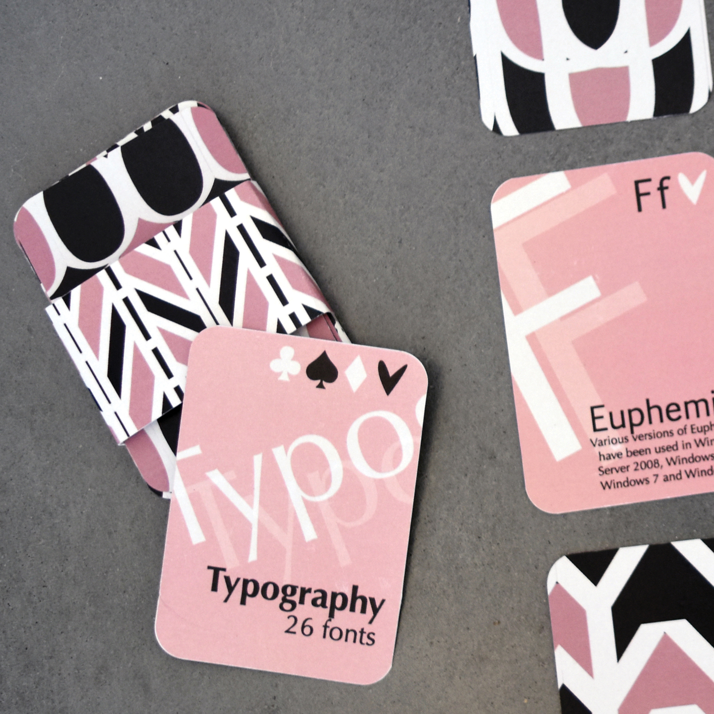
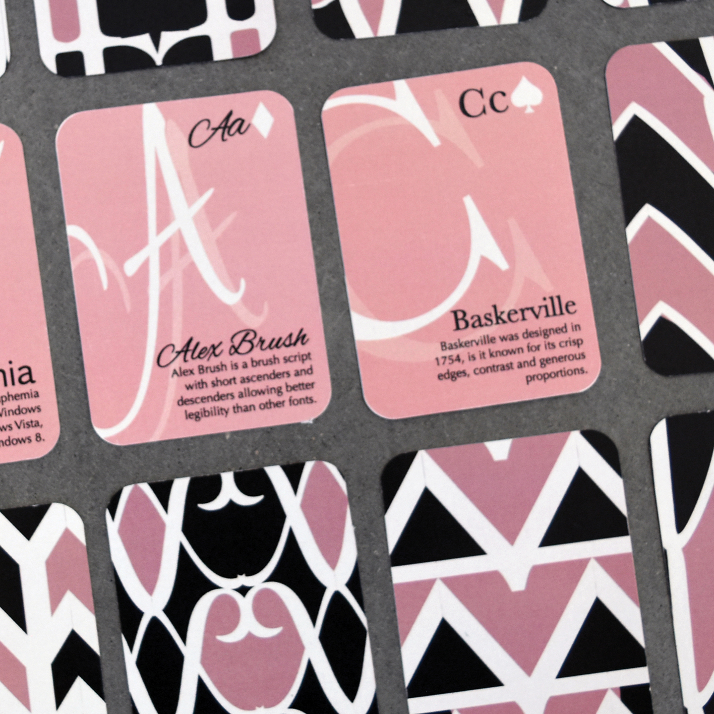
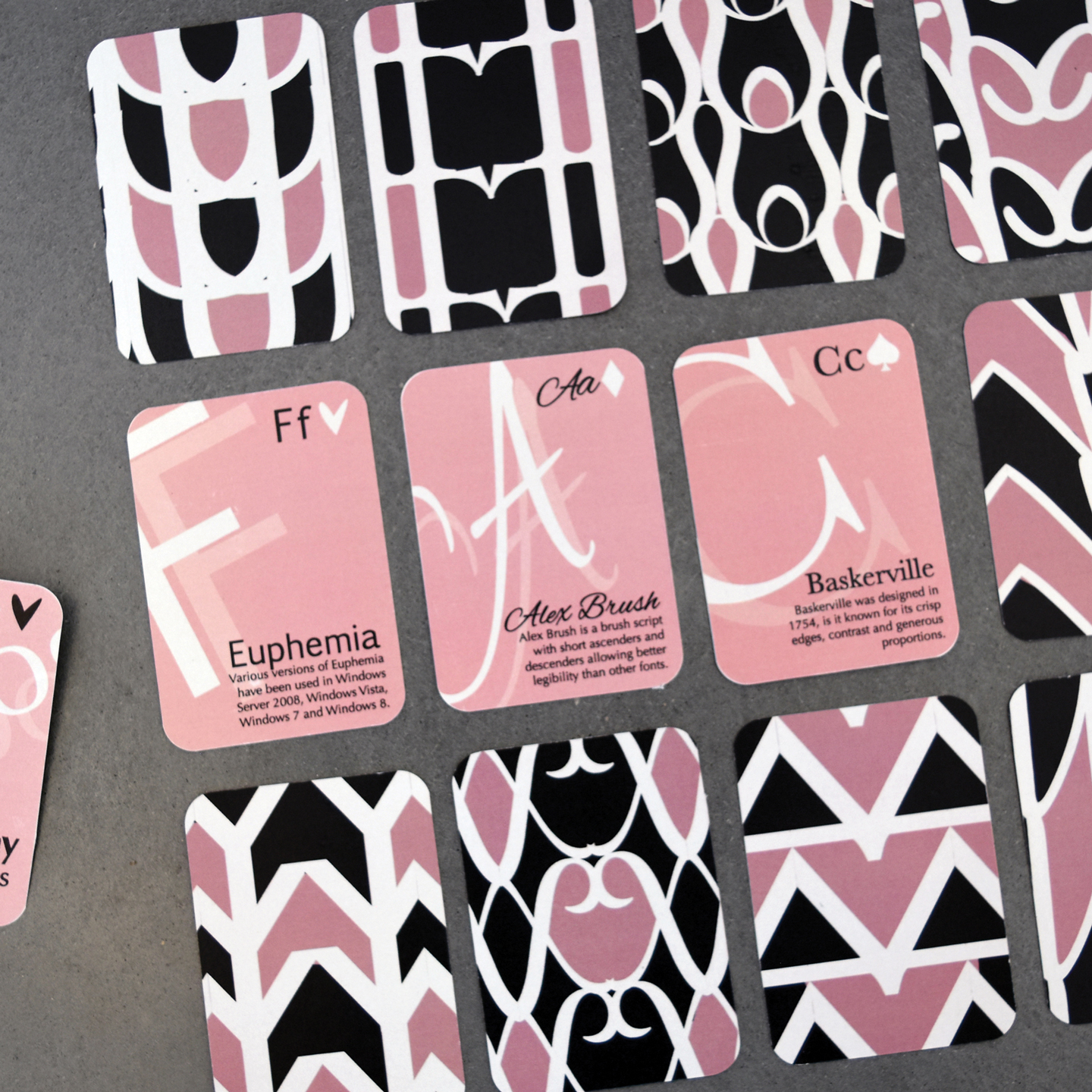
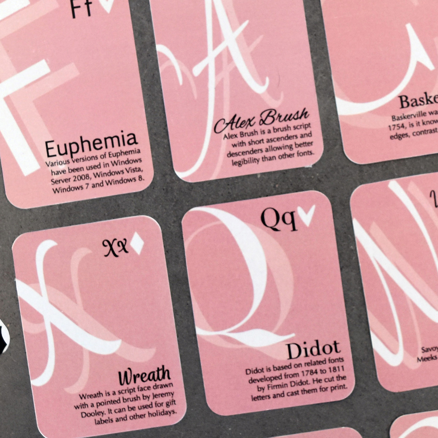
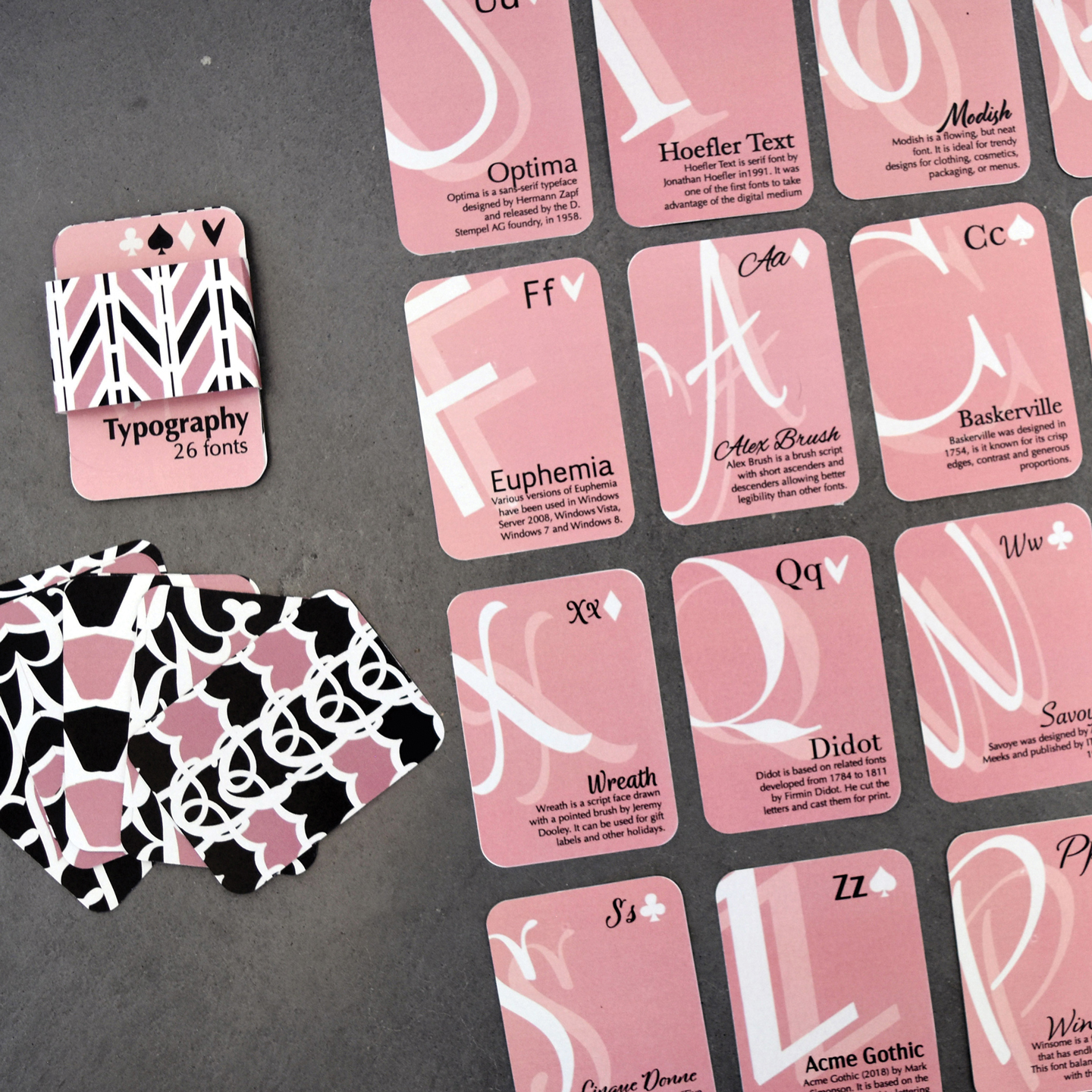
This particular project required the design of a typographic deck of 26 cards, each symbolizing a different letter of the alphabet and featuring a distinct typeface. The main aim of this project was to ensure that the design of each card was consistent while retaining the distinctiveness of each typeface.
The initial step in this project was to choose 26 different typefaces and work on the design concepts through sketching. Once the best design concept was developed, a distinct visual system was created that was consistent throughout the entire deck.
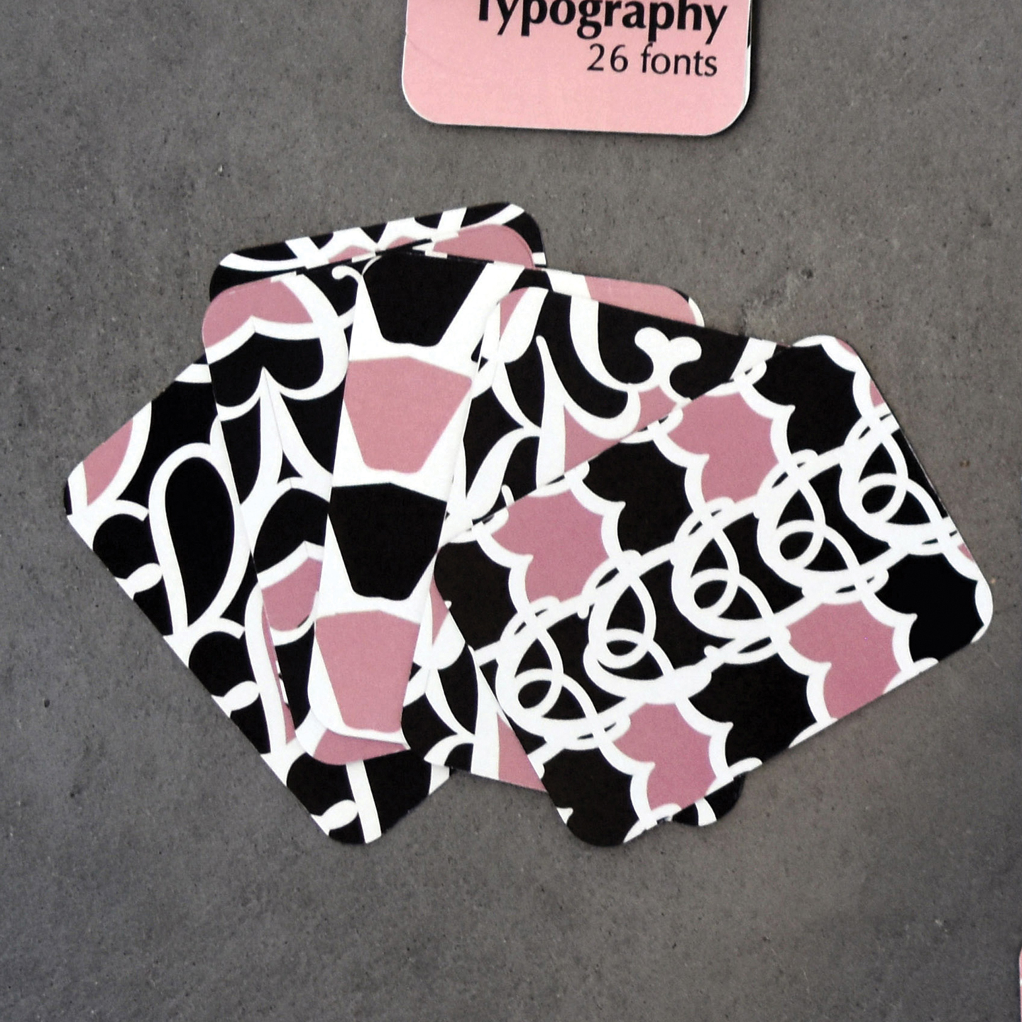
After completing the front designs, I created personalized designs for the back of the cards using mirrored lettering to produce abstract designs. This ensured that the designs were aesthetically pleasing and that the lettering was not literal.
One of the biggest challenges in this project was ensuring consistency in the designs, which varied greatly due to the different patterns and fonts used. This was overcome by ensuring consistency in the use of color, size, and pattern density.
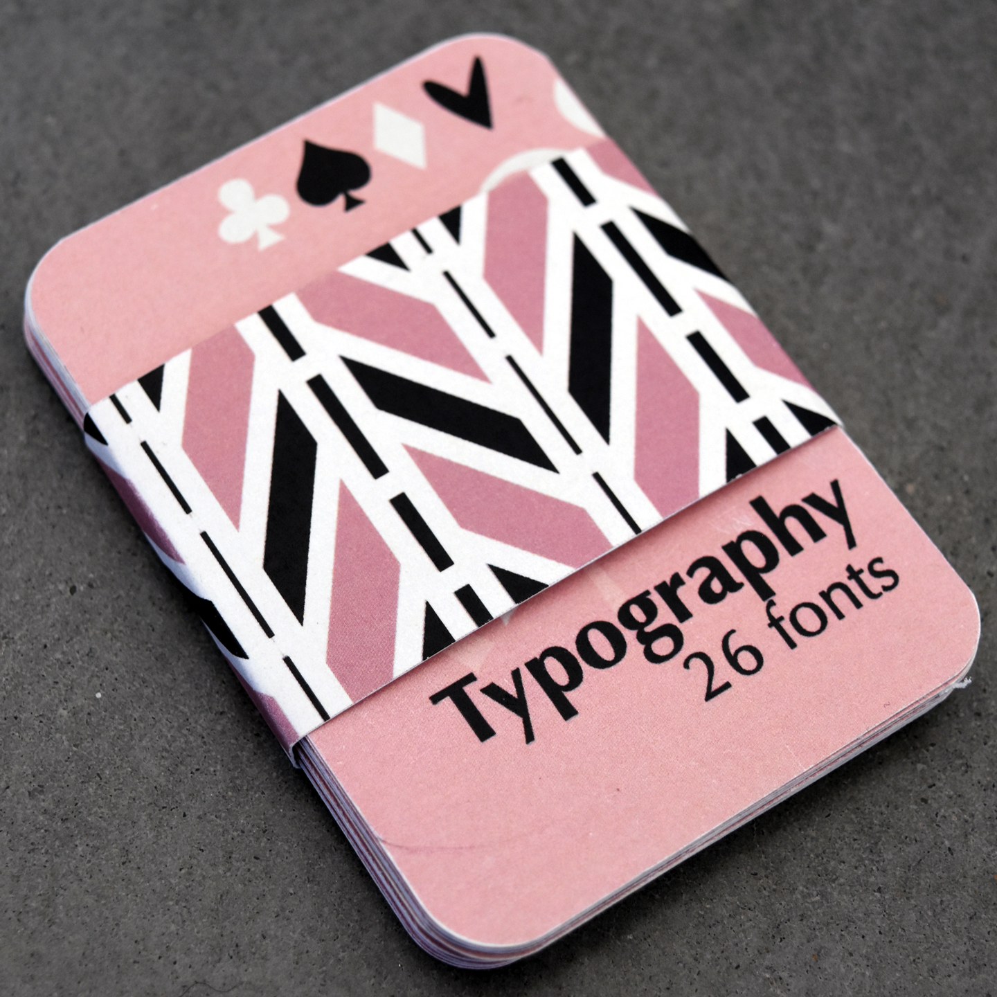
The final project is a consistent typographic system that ensures a balance between consistency and uniqueness.