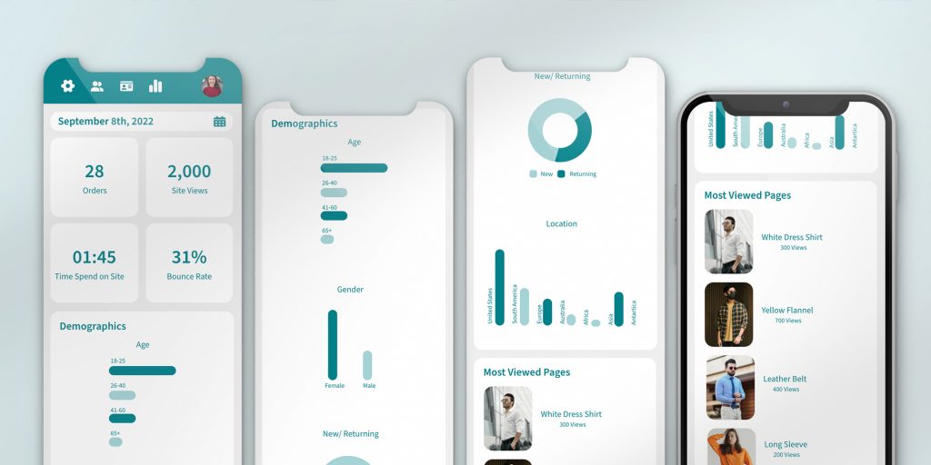
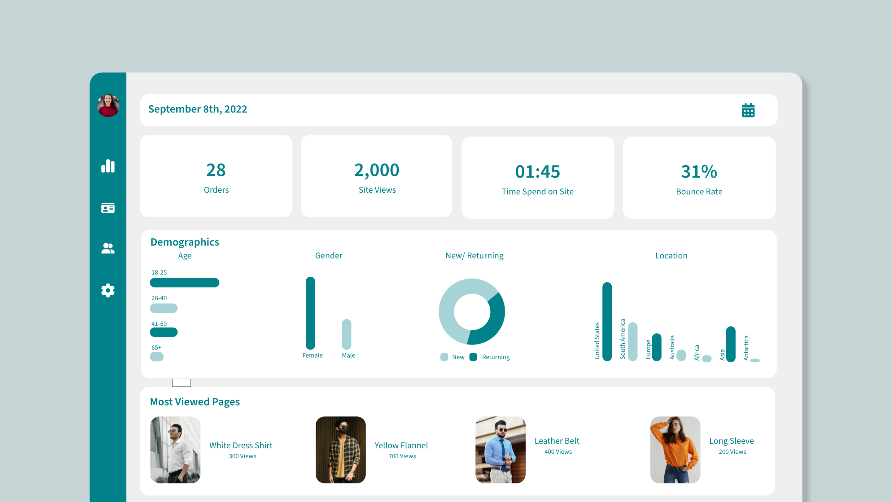
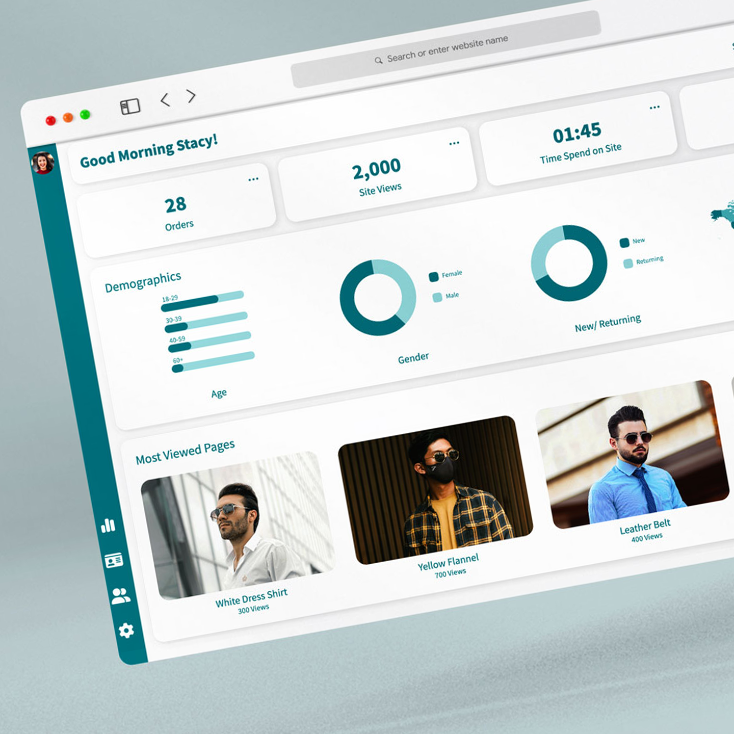
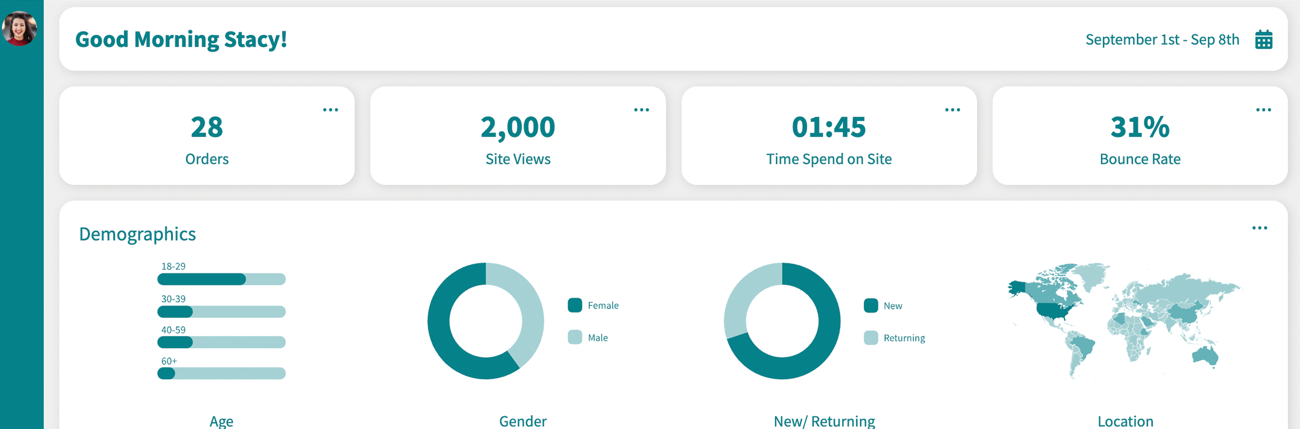
This analytics dashboard was built with a heavy emphasis on simplicity, readability, and ease of data interpretation. The aim was to develop a clean and readable dashboard that would enable business owners to easily interpret site performance data without being bogged down by too much information.
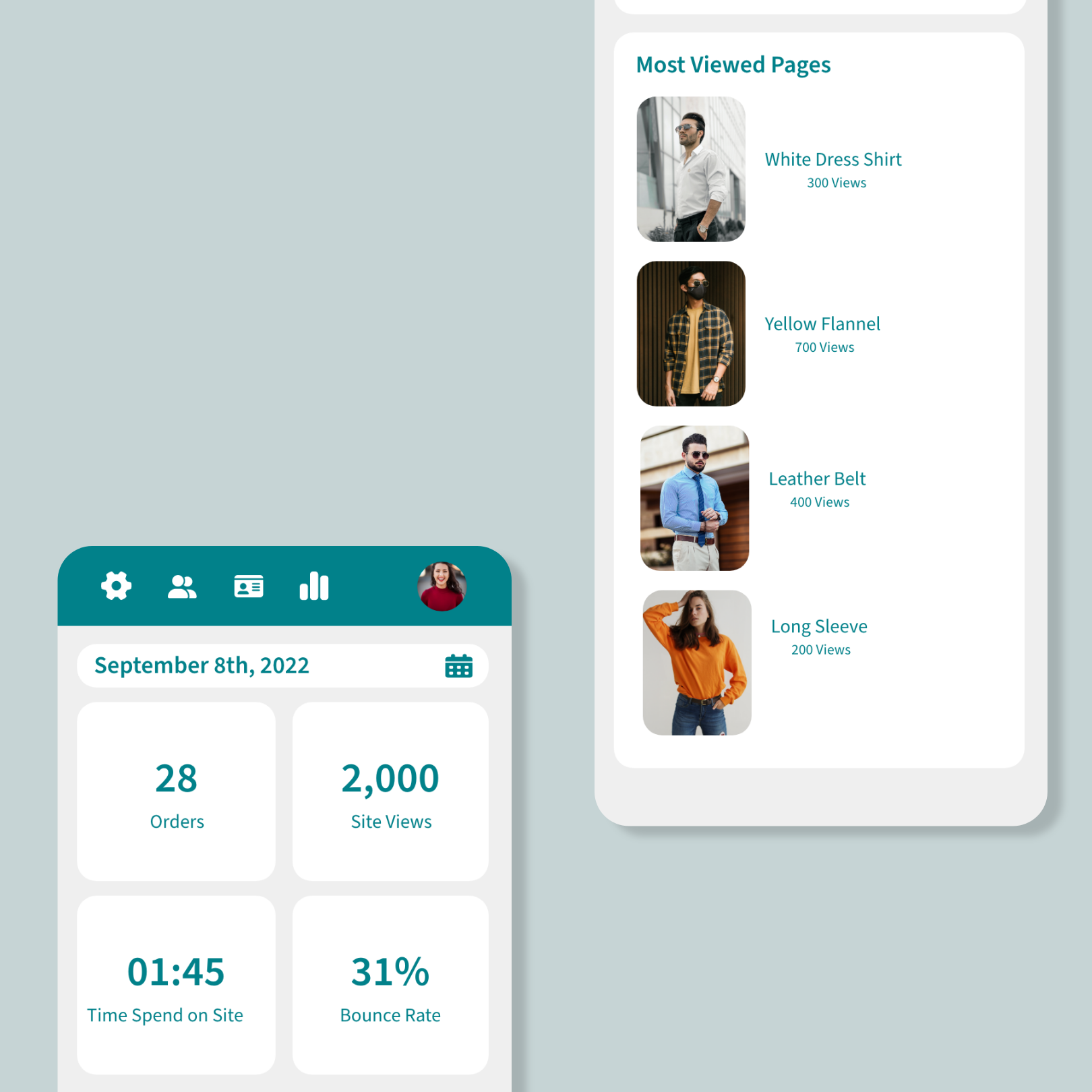
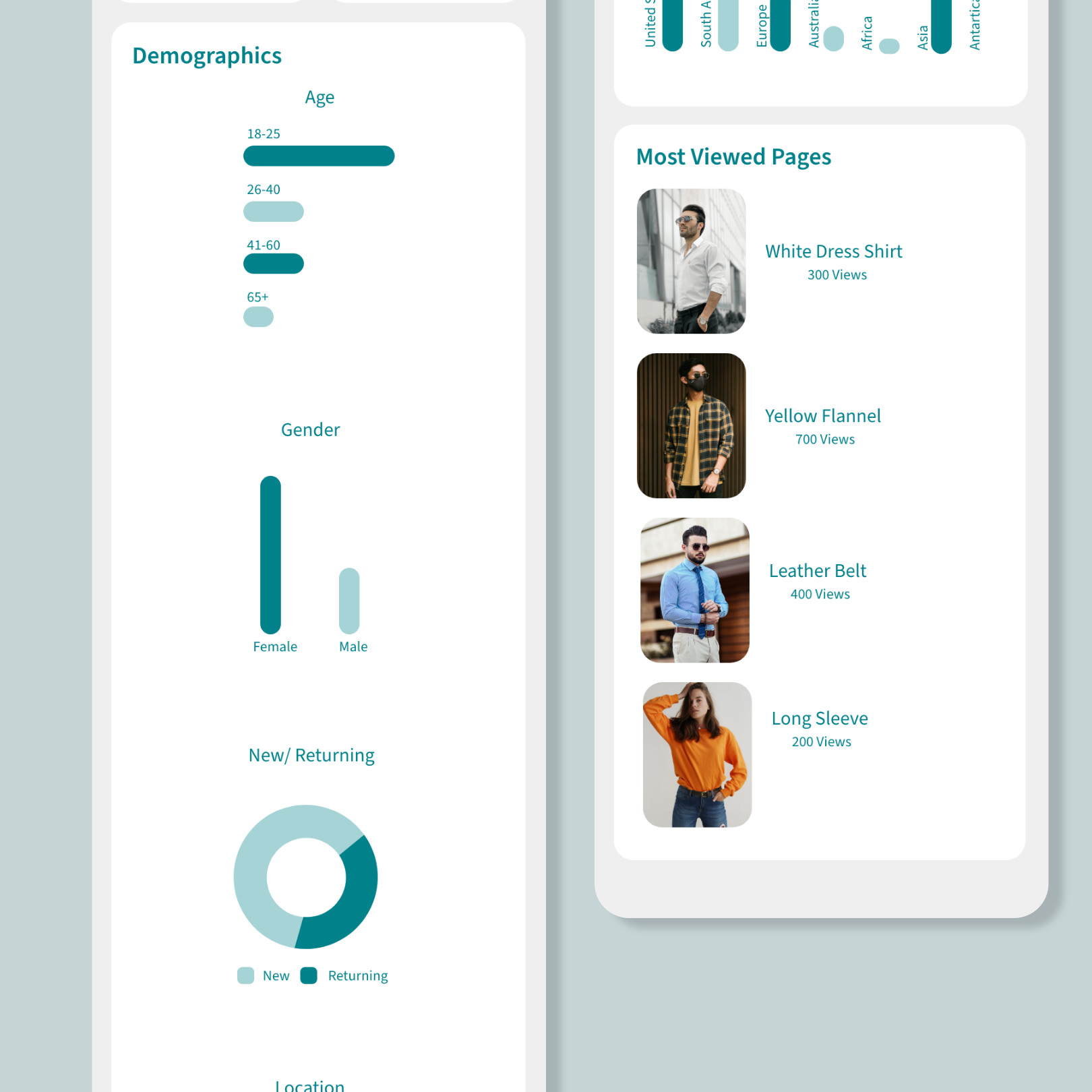
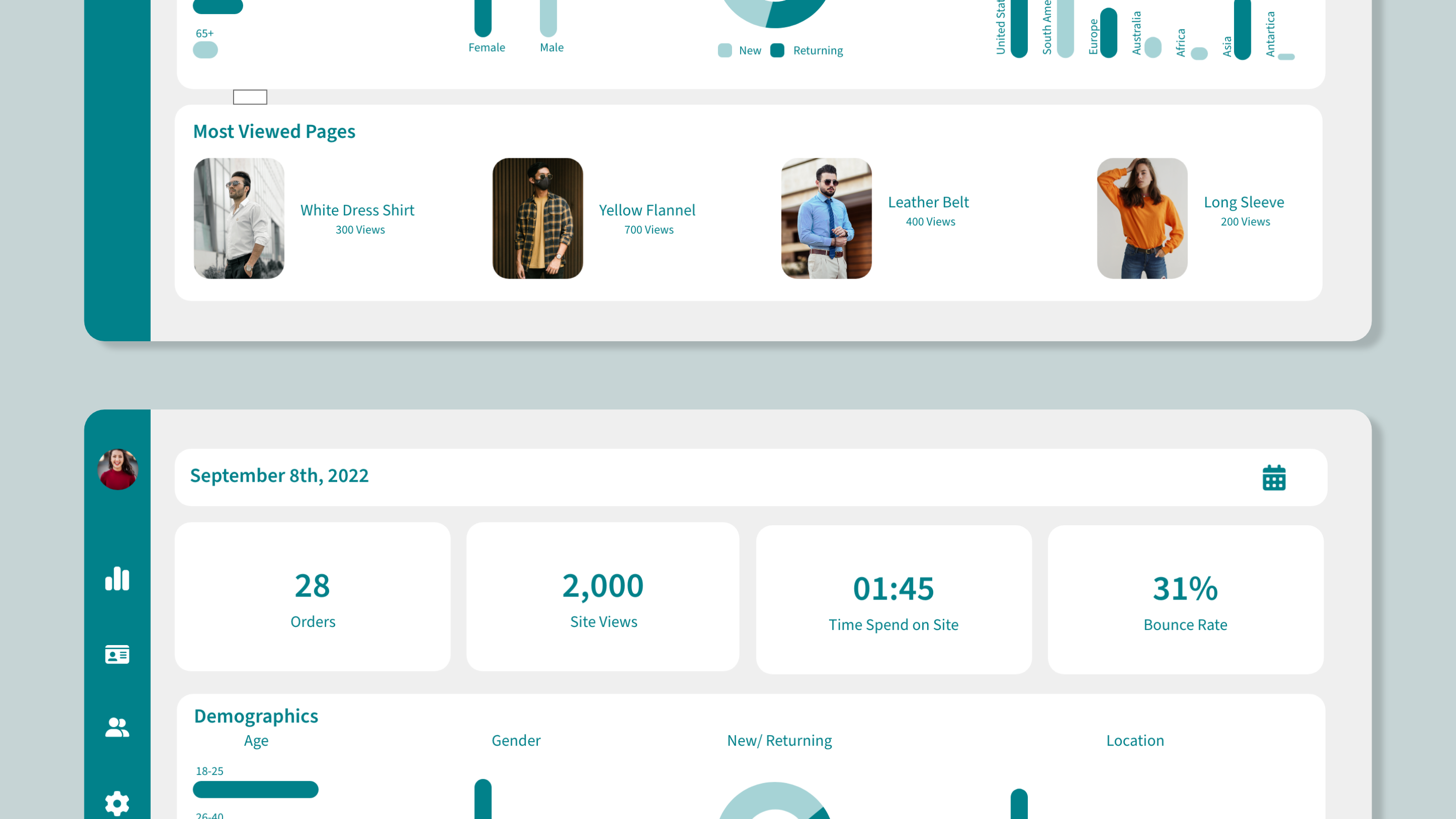
To achieve this, I opted for a simple color scheme, minimal text, and plenty of negative space to highlight hierarchy and facilitate information scanning. This dashboard offers essential information such as visitors, orders, time on site, bounce rate, demographics, and page activity, enabling users to derive valuable insights.
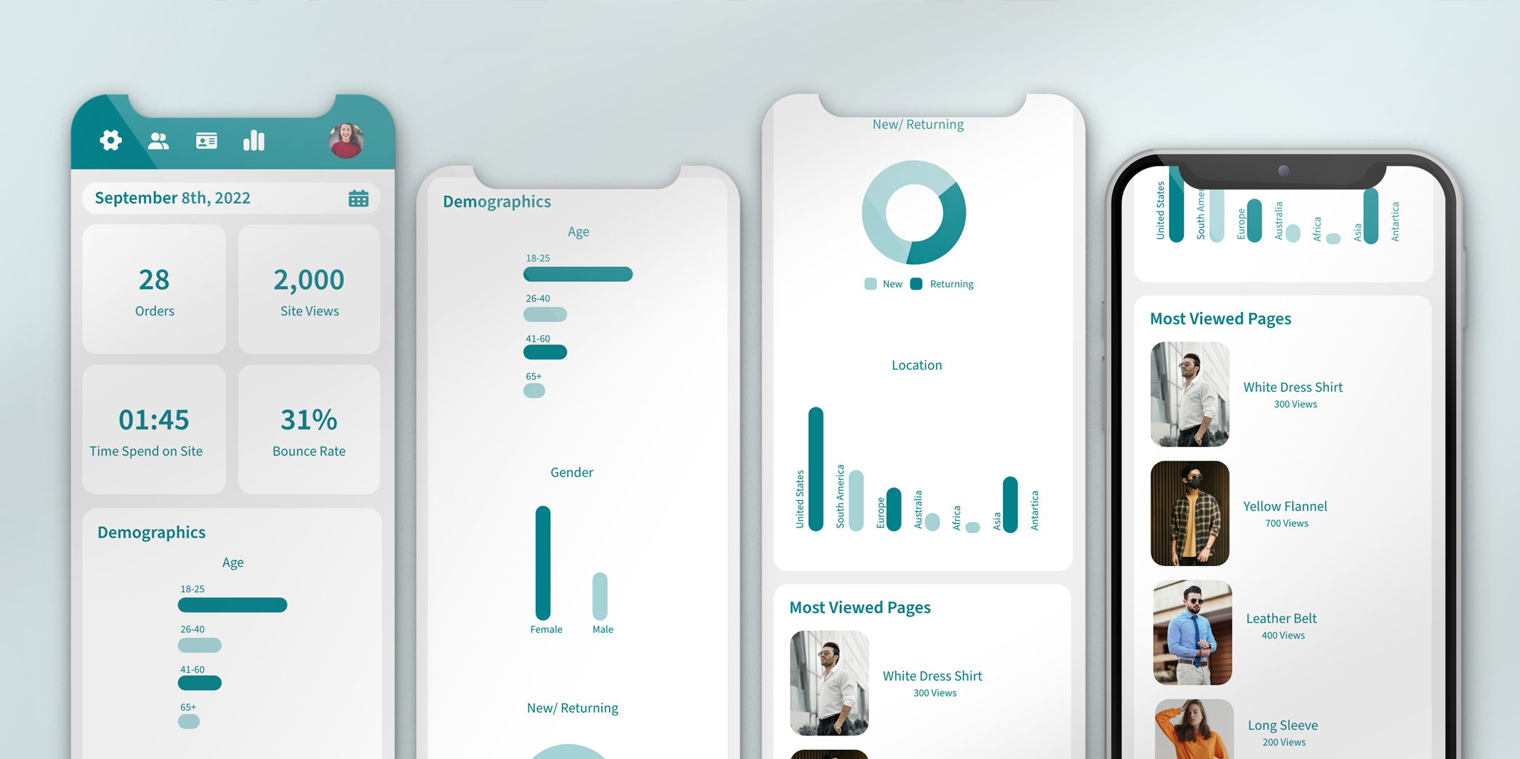
One of the primary challenges was maintaining a non-scrollable layout on desktop while ensuring the interface adapted across varying screen sizes. While the design worked well on larger displays, smaller screens caused content to become constrained. To resolve this, I refined spacing, removed non-essential elements, and optimized layout structure to maintain clarity and balance. I also implemented responsive adjustments for smaller and mobile screens to ensure usability across devices.
The result is a clean, structured dashboard that prioritizes readability, efficient data interpretation, and consistent performance across screen sizes.